Thursday, May 16, 2019

Extra Credit Module 16


This course actually exceeded my expectations by a lot. I am a totally inexperienced artist that took this course as a requirement for IF. I expected that it would be a struggle and that I would not get much enjoyment or learning out of it. I was wrong. 
I would define art as an expression of one's unique vision that may take a variety of forms. My initial definition was not totally off base. What I took away from the ability to analyze the different forms mentioned in my new definition. 
Who was your favorite artist in your original posting and who is your favorite visual artist now? If there is a difference, why do you think so? If you have the same favorite artist, why do you think so?
 My favorite artist in my original blog was Banksy. I still appreciate this artist, however, my knowledge and exposure was broadened a great deal! I now appreciate artists such as Frida Kahlo as being favorites. 
I enjoyed taking this course online. Submitting my work online was less intimidating for me. I also liked the ability to manage time as it fit my unique needs and schedule. There was such a great variety of assignments in this course. Im not sure that could have been achieved in a classroom. 

Sunday, May 12, 2019

Project 5 Art Analysis


Pablo Picasso's painting, Guernica, uses several elements and principles of art that have been discussed throughout the course. The contrast and change in value from white to black are most obvious. There is also the use of shape and forms throughout the piece. The use of distinct lines create these very defined shapes.
Guernica is a mural size canvas oil painting. The influence of Nazis on the Spanish American War. It is said to be Picasso's most political piece and a response to Nazi bombing of the town of Guernica.  Picasso used the bull and the horse (popular Spanish characters). This makes interpretation difficult, but in my opinion the bull represents fascists threat over the horse(people of Guernica).
I feel that the absence of color and the dramatic and harsh shaped in the mural create a very intensely disturbing response. I feel a sense of anxiety and fear when studying this painting. Even though the forms of the people are abstract they still show the emotion of fear in their faces and the positioning of the characters depicts violence. I think that it is difficult to criticize the work of a famous artist by Picasso. I do not like this piece myself, but it is not because he did anything wrong in making it. I think the emotions that I felt looking at this painting is likely what he intended to create.

https://www.pablopicasso.org/images/paintings/guernica3.jpg

Self Portrait

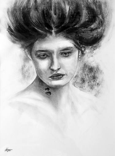
Photograph of myself

Pencil Drawing based on photograph
The inspiration pieces below all make good use of space to create a rather realistic more than abstract version of a self portrait. I used the online resource provided to visit a virtual art museum. I was drawn to portraits of women that I felt some similarities and connection with in order to gain inspiration for my own attempt and drawing myself with pencil. I thought that pencil would give me the most control over my drawing and I did use a tracing technique to begin the project. My own lack of confidence in my drawing skills was my biggest obstacle. This piece captures me in a kind of cartoonish form and I actually really like it. I used the principle of light and dark shading in this drawing as well as line and texture for my hair. There is no color in this drawing and I am glad that I left it a black and white piece. I did not think I would enjoy this project as much as I did. I think for a non art major it is pretty good!

My three inspirations
Self Portrait with Necklace by Frida Kahlo
Portrait of Pita Amour by Diego Rivera
Image result for unnamed self portrait
Unnamed by Nuno Pinto

Saturday, April 27, 2019

Module 11 - Art Gallery Visit #2


The title of the exhibit that I visited was, Chemical Light, by Victor Shanchuck. 
This exhibition was made up of a collection of liquid-like observational figure drawings from the 1970s that were made using photographic chemicals instead of classic drawing materials.
The lighting was dim and was directed only at the drawing themselves. The space was kept rather dark in order to support a slide show that was being projected on two opposite walls. The walls were painted a neutral gray and gave off a sort of mysterious or even "spooky" vibe, in my opinion. There were some leather chairs placed in the center of the room but the seating was very limited. There were two entrances into the exhibit space which was more enclosed than some of the others at Burchfield Penny.The viewer's attention is led from the projections of the art on two of the walls to the  actual pictures on the other two walls. The sound of the projector makes us aware of the projections and gives off a mechanical feel at this exhibit. One wall had several larger pictures lined up in a straight row, while the other had more of of a grid of  several smaller pieces of art. The pieces themselves were all very similar and abstract. The colors and specific shapes of the designs varied and the use of very vivid and varied colors made the art really stand out among the drab background. Each picture was framed very simply in a black square frame which actually barely showed since the background of the pictures are all black. The pictures were not individually titled and labeled. They are all part of one work of art. 


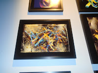
This piece is one of the smaller pieces that was part of a larger display of pieces. It uses complimentary colors of blue and orange which make it very appealing to me. 
I
This next piece uses a variety of color and uses line to create a beautiful effect. In my opinion, this piece looks like a beautiful gift wrapped present. The artist uses the entire space for this piece.

I enjoyed the different use of space in this work. It is not symmetrical yet it still uses the whole space. This piece seems to show the very abstract nature of this type of art. 

It was a very different experience to visit a gallery to specifically study the creation of the different exhibitions. I think it was very interesting to see how the artists use of a specific space can effect the viewers experience and even their enjoyment of the art itself.  I never realized that things such ass wall color and placement of seating etc was so intentional until now. This exhibit that I studied, Chemical Light, would not be my personal preference due to the modern and abstract designs. I can appreciate the overall vibe that the artist was trying to communicate with his exhibit design though and I learned a lot from this gallery visit. 


Sunday, April 14, 2019

Module 10 Mask Creation


    Image result for masks of mexico day of the dead
These 3 masks are all from Mexico. In my search for masks online I found that I most drawn to the masks of this region. All 3 of these are very symmetrical and have  balance and a similar shape. The element of color is best used in 1 and 3 in my opinion. The 2nd mask inspired me with the use of the element of texture with the addition of hair to the mask. I am inspired by these masks to create my own mask that has similar qualities of color, balance, and texture.

My sketches were an attempt to combine the elements in the 3 masks that I was inspired by. I wanted to capture the Mexican ideas from the colorful day of the dead masks and also add the texture of the hair. I did not specify what colors I would use. Reflecting on this, I wish I would have. I planned the balance and symmetry as well as the use of space on the mask that I would use.

My final piece was not exactly what I expected. As I began painting(with the acrylics that I used in the earlier module) I found that I wanted to add certain things to my design. I am not pleased that my mask looks a bit scary. I did truly enjoy creating this mask though, and I think that there are so many ways you can design a mask like this. I can see why so many cultures were able to create such different and creative masks. The possibilities are endless and I did love the creative freedom of this assignment.

Sunday, April 7, 2019

Module 9 Art Project

1.What was it like using your hand as subject matter for a drawing? 
Using my own hand for this drawing was very interesting. It was odd how much I did not actually know the details of my hand until trying to draw it in proportion and with needed details. It did make drawing a bit harder because even with the dominant hand I was only using one hand. 
2. What media did you select - pencil or charcoal? Why?
I selected a pencil because I thought I would have more control and precision than with charcoal . I had a difficult time with the shading activity used for gradient. 
3. How did it feel to create a drawing with your non-dominant hand?
It was very awkward and I had much less control. The non dominant hand allowed me even less artistic ability. 
4. Compare and contrast your final drawings. Do you think they are successful studies? 
I feel like doing the drawings did accomplish a purpose for me. As a non artist, it was a huge challenge and although it may not look it the drawings did take time and concentration. It definitely gave me a greater appreciation for the talent of artists such as Michaelangelo that master the drawing of the human body. 
5. Would you consider using your non-dominant hand to create artwork in the future? No. I felt much less capable of working with this hand and would not prefer to create with this hand. 


Module 9 Videos


 I choose to watch the two videos from the list for different reasons. I watched The Drawings of Michael Angelo because he was a familiar artist to me. His work in the Catholic Church is very well know and his most famous work in the Sistine Chapel has always interested me. I picked the video Valazquez for the opposite reason. I know very little about any of the Spanish artists and I was interested to learn about who he was and what his work looked like. 
I learned a lot about Michael Angelo by watching the film. I did not know that 19 of his works are kept at Princeton for viewing and studying. This man drew all his life and at 12 years old he finally got his hesitant father to accept that he would be an artist as he took an apprenticeship. As an apprentice he used human models to draw detailed sketches of the human body. 30-40 years later, Michael Angelo continued to use the ideas from his mentor although he denied any debt to this man. The drawings that Michael Angelo did of the male human body showed an amazing anatomical understanding of the body. These pictures actually set the ideal standard for body builders as they showed each muscle perfectly sculpted and proportional. He started his sketches at the core of the body and eventually they grew into a moving body. Detail was blended with idealized and some impossible poses. Michael Angelo sought perfections in his 60 years focused on the nude male body. It was not surprising to me then, to learn that he fell deeply in love with a man in Rome. I was surprised however, to learn that he actually wrote a poem complaining about his work on the Sistine Chapel. The pope commissioned him to this famous job and I was surprised that he did not love it. His work as he got older progresses as his own aging body and soul. As he drew the crucifix, this was a far different work from that of the sculpture of Adam. He expressed both hope and dread of death in this painting. 
Valazquez was very different from Michael Angelo. He was a very discrete and educated Spaniard. His art captured the elements of light and his figures were sometimes is shadow. He had one friend, the king, and  one love, his wife. He enjoyed realistic themes and thought that life was all that mattered. To me, his paintings looked like posed photographs against fake backdrops. The detail was in the person he was painting, not the landscape. The pieces were also lacking much color at all. They seemed very gray to me.He was a very slow and deliberate painter. My favorite of his paintings were of the young Prince Baltisar. His paintings of the palace jesters were very interesting as they attempted to express beauty and human quality beneath hideous exteriors. He used the element of soft and strong colors to allow people to look inside these characters.
I thought both of these films were very good at summing up both the life and most famous works by each individual artist. The films add more interest than the textbook as far as allowing us to understand these famous artists, in my opinion. The two sources are paired very well though. There are many more examples of pieces in the text and reading the descriptions allows for a better understanding of the work itself while the videos help us understand the people themselves. 

Sunday, March 24, 2019

Module 8

Explain why you selected the video you choose from the selection listed above. 2. For each video list/discuss the key concepts you learned. 3. How do the videos relate to the readings in the text? 4. What is your opinion of the films? How do they add depth to understanding of the readings and art concepts? https://artonlinespot.blogspot.com/2019/03/module-8.html
I selected the video, The Greek Awakening, Art from the 5th Century, because at the end of the first video, More Human Than Human, the Greeks were part of the study on the idea of how the human form was seen by different cultures. The Greeks saw the body as a source of great pride and the male, athletic form was prized. This left me wondering more about the Greek culture and its connection to art and modern society in general.

In the video, More Human Than Human, I learned that the way ancient and modern day sculptors and artists represent the human body really is a reflection of different cultural aspects of their society. I found it interesting that they related the very early statue of the Female Figure from Willendorf  to the very primitive idea of the eagle's beak. The exaggeration of certain body parts for our early ancestors was a function of their cultural values and need for survival, procreation, an nourishment. The Egyptians, on the other hand, valued order and that shows in their very straight and orderly looking statues. Looking at the Greek wars and Olympic games, it is easy to see why that culture valued a strong athletic build.

In the video, The Greek Awakening, I thought that the most powerful idea was that in order to truly understand who we are we must understand where we came from. The pride of the Greeks is well earned. Their contributions to our government and way of life is huge. Greek architectural masterpieces were described and explained. The symbol and image of Greek culture has much to do with the Parthenon and other iconic pieces of art. The desire to be at the center of existence was a big desire during this period.

I thought that the videos were paired up perfectly with chapter 14. On page 322 and 323 there is a photo of the  Female Figure from Willendorf that is discussed in more detail in the first video. I feel that the discussion in the video really brought that information to life and made it more interesting than the text could. The text provided many more photos of the typed of stone and marble art that were created by ancient civilizations. The picture of the Great Sphinx is a great example of the straight and orderly society of Egypt. The book and videos both made me wish I could travel to Greece to explore the modern city of Athens as it was shown in the intro to the video.

I enjoyed both video and I thought they were well connected by the idea that art is really a reflection of the culture and concerns of the people and place where it is made.  They both added understanding and interest to the readings by giving me more of an analytical view of art (1st video). Both videos used history to explain art as the book did as well. 

Saturday, March 16, 2019

Module 7 Video Review Blog


The video, Architecture: The Science of Design was my favorite of the two that I picked to watch. This video discussed the idea of downtown living being "in" again and the challenges that are faced when architects are forced to build up due to the lack of space in these areas. I learned that the term superstructure refers to the part of the building that is above ground and that the substructure is underground. This substructure is very important since it must support the weight. Wind is a big problem when building therefore, a lot of data studies are done regarding speed and turbulence of wind on smaller models before building. Architects may enlarge the base or even plant trees based in these findings. I also learned about the amazing innovations in home computer systems that control many daily activities in the home. Home computers can now be programmed for things far beyond the basic things such as heat. 
The second video I watched was, Frank Gehry, Architecture as Art. This architect's work changed a lot over time. He started with residential projects and his goal has always been to combine functionality with structurally pleasing forms. His goal is to create emotional responses to buildings and to create more than just empty containers for people to work and live etc. He says that his work is a reaction to some of the lifeless and cold "boxes" of modern architecture. He used designs for houses in California to experiment with materials, light, and space. His friendships with pop artists helped him mix in art with his major building projects.

The videos were closely related to some parts of the text. The topic of load-bearing construction was covered in the beginning of the chapter and the structural systems in architecture are definitely a primary concern for obvious reasons. The Great Friday Mosque was used as an example of a technique of using wooden poles to anchor scaffolding that is used to restore the mosques coating every few years. This is very different from the structural plans in the video but also very interesting. I found many of the pictures of the architecture in the book to be more of what I consider attractive (compared to the video on Gehry).The book did cover the idea of steel frame construction as well and on p 303 it does reinforce the idea that many look alike and undistinguished building were build due to required laws. These are the types of buildings that I am sure Gehry was talking about when he referred to the boring box type containers. The work of Frank Lloyd right shown in the text would seem to me to relate more with the look of Gehry's work. The idea of sustainability at the end of the chapter may relate well with the topic of home computer systems in the first video. The way homes and buildings are being built now combine both form and function of new material and energy sources. 
Both films were interesting in different ways.I enjoyed the first film a bit more because I simply found it more interesting. I am a fan of big cities and have always been interested in downtown living in cities such as New York, so learning about all the goes into designing skyscrapers was fascinating. I find it a bit scary how much movement actually does occur in tall buildings! As for the section on modern home computer systems, I can see that this is definitely the future. Simple technology such as Alexa is a first step to the technology that was shown in the video. The video gave an example of a computer being set to change the temp when you wake up, turn on a temperature controlled shower, relaxing music, brew coffee etc! I see this becoming something that could be standard in homes during my lifetime which is so exciting. 
As for the film on Frank Gehry, I think that I now have a much better understanding of who he is and what he attempts to create with his architecture. I like his opinion that a building or especially a home can and should also be nice looking. When looking at his work though, it did not appeal to me personally. I personally  don't see his buildings as beautiful. I think they are very modern and I am used to more traditionally beautiful pictures of homes and buildings. His buildings look unfamiliar to me. Maybe it is more of a California style that I am simply not used to. 
I chose the 2 films because of the previews below the film. I had heard of Frank Gehry and was interested in learning about who he was and what his work looked like. As for the first film, the idea of peaking into future home technology was very intriguing. Also, as I said, I visit big cities whenever I can so the architecture there is a topic that I knew would keep my attention. 

Sunday, March 10, 2019

Logo

I created a sketch of several designs that I found ideas for online.

I wanted to see how each would look using acrylics
I love this logo . It was the runner up even though it was most popular with my family


The process of creating a logo was a lot more fun than I had imagined. I used a lot of the information that I learned about in previous modules to design a logo that I would like to represent me.I used some ideas from www.freelogoservices.com.
I considered the elements of color and symmetry when designing my logo. In the video the red logo was an intentional choice since red is a strong color. I enjoyed watching the business select the design (which is basically the Target logo). I learned that a strong yet simple logo looks more appealing to me as well as the man in the video. The choice for my final selection was not easy. I think that my second choice might actually be better and more businesslike but at this point in my life I like the upturned rays and lively design of my final selection. I used the color blue due to what I learned about the positive and energizing effects of blue. I think that the logo I choose represents my youth and positive energy.
This logo was my pick. I think that it represents who I am right now at 19 years old.


Module #6 Review of Blog Postings

Below are the two blogs I reviewed:


szeninagrace.blogspot.com 
https://grecojr01aed.blogspot.com/


I did agree with the elements and principles that I reviewed in the blogs of my peers. I definitely saw some familiar images from what my slideshow included and also saw some great ideas that I would not have thought of. The picture used for movement in slideshow one made me stop and look at it for a bit longer to really see the idea of movement, but I do think that I saw it. Water was a much more literal example and one that I used and saw in slideshow 2. I noticed that in the photo for line there was also a great example of light. This photo probably could have been used for either element.
There was one image  that I found in common with the peer blogs I read(This is not a Fountain") Yes, the reasons that my peer and I chose this image were slightly different but we both agreed that this was an interesting piece of work that was made with a good intention. I believe this was he only image that I had in common with either blogger, however, I did recognize all of their pieces from my own visit and enjoyed seeing what other classmates chose and connected with especially.
The Liquor Sign from Harlem that was restored now interests me more. I would like to visit the gallery again in order to spend more time viewing it in person. During my first visit I passed by it rather quickly....so quickly that I did not notice the word SOUL standing out among the other letters in red. If I were to return I would also like to study the molds of the hands more closely as well and take time to read more about the meaning of this piece.
I really liked reading the reviews of my peers. I enjoyed the different perspectives and I appreciated that one of the blogs that I read was of a more experienced art student but that the other was more like me. I think that both types of students can contribute a lot. I wonder if the art majors enjoy reading the viewpoints of people who have little or no experience with art and may have only this as exposure. 
I have no comments yet! Hoping to have some soon.

Saturday, March 9, 2019

Module #6 Video and Text


In the video, Through the Eyes of a Sculptor, there were many very interesting facts and ideas that I learned about sculpture. I honestly did not imagine that quarries are actually locations where many sculptors actually work. I thought it was fascinating to watch the artists create works of art from a block of rock. The idea that the rock from these tunnels actually cuts easier than wood with their saws was new to me. I liked the quote from the artist that stated that an artist must know who he is order to create his pieces.  The restoration footage in the video surprised me in that I did not know how the molds for great sculptures were made and then saved for future recreations. I also though it was intriguing that carvers often train by doing restorations which actually require them to work "in the footsteps of the original artist." 
The Glass and Ceramics video was of less interest to me but I did learn many new facts about these two forms of art, such as that glass is not a true solid. The mixture used to make glass is actually 60-75% sand plus an added component and can be shaped at will. The stained glass making was fun to watch. The use of light factors in even more than I imagined in the final result. I liked watching the sketches being made, especially the full sized sketch which is the basic pattern for the puzzle of glass pieces. In the section on ceramics, I found the modern applications of ceramics most relevant.I had always connected ceramics to something my grandmother enjoyed but I see that it can be used for things like making engines for cars! Apparently it is lighter and more fuel efficient.

The book and text were related by topic but I did like how the book showed examples of famous sculptures, glass, and ceramics. There were ideas that overlapped also such as the description of the methods. I found the sculpture of Michael Jackson and Bubbles on p 246 interesting because of its use of white and gold when the outfits and other details were transposed.The use of black eyes and red lips to focus attention on the bond between them was smart. The book went on the discuss other media that the videos did not, such as wood and metal. I enjoyed reading about some of the specific piece of furniture, such as the Cinderella table by Jeroen Verhoeven, which was made of plywood.

 I enjoyed the videos and I definitely thought they both added to my understanding of the topics. I have a greater appreciation for the time, effort, and process that even a simple drinking glass is created from. I enjoyed listening and watching first hand accounts from artisans that have worked in the field and experienced the pride of creating these works.

Wednesday, February 27, 2019

Gallery Visit # 1

C.)This piece called, "This is Not a Fountain", by by Subodh Gupta, captured my attention and brought up many questions in my mind about how the actual assembly of the pots and other metal objects were put together and also connected with a water source. I found it intriguing that the artist went to India to collect these artifacts for his piece. There is a sort of symmetry to the "mess" of pots that I enjoy as well. This is a modern piece made in 2011-2013.

B.)I connected with this piece because it has a modern appeal. The neon frame fits my personal style. I took several pictures with the work of art. The use of light in this piece makes me feel happy.

C.) This oil on canvas painting  by Paul Gauguin got my attention. It got me wondering what the artists intention was with this work of art. It has a morbid feeling to me and I found it interesting that it may be a statement about old vs young. The specter in the background makes me curious about what she her intention is and what she is thinking. I like artist's  the use of color to portray this mood. 

A.)I feel intrigued about the relationship between the father and daughter in this oil on cardboard picture from 1903 and I wonder why the artist, Edouard Vuillard, made them intentionally blend in to the scenery. I like that he did that as it creates a relaxed, soft look.

A.)This picture from 1885 amazes me because the artist somehow makes this woman "glow" from the canvas. The paint colors are striking. I love the smooth look. The character looks alive and stands out. Even though this is not a piece of art that I connect with or would own, I am very interested in the way the artist created this effect. It looks almost like a photograph. John Singer Sargent used oil on canvas. I think the oil paint my explain some of the reasons for the appearance of this painting. 


B.)I felt an immediate connection to this drawing by Mary Cassatt when I saw it. It looks a lot like baby pictures that I have seen of myself with a bonnet on at my baptism. I like the way the pencil creates variation in shade. I would display this sketch in my home someday. I like the inquisitive expression on the face of the baby. The drawing was done with pencil and paper in 1890 but is timeless in my opinion.

Saturday, February 23, 2019

Module 4

Discuss what you thought about creating the Value Scale and Color Wheel.
I found that creating the Value Scale and the Color Wheel allowed me to truly experience what I saw in the videos and both creations were a lot more difficult than I thought! I has a lot of trouble using the charcoal pencil in order to create steps 3-8 on the value scale. When I tried to apply the charcoal it was difficult to control the value when it was slight. I attempted to smudge the pencil to lighten some of the values but I feel it did not work entirely. 
The color wheel was another learning experience. This experience was only difficult because the first set of paints that I purchased looked like the Cyan and Magenta but ended up being the primary blue and red. I did the color wheel with these primary colors and then went back to the store to purchase the Cyan and Magenta. The photos attached include both color wheels. 
I definitely enjoyed working with the acrylic paints better. I liked the thickness of the paint and I enjoyed the way the paint went on the paper rather smooth and richly. Mixing the colors was actually fun. I think that I would enjoy trying more acrylic painting. 
I think that the most important discovery that I made in this activity was the truth about the primary colors of red and blue being too dark in comparison the cyan and magenta when combining them. I learned this through a trial and error.
I enjoyed watching the videos because they gave me a visual guide on how to create these experiments. Without the videos an in experienced artist like myself would have been very confused through the process. The videos were an important part of the content included. 


Sunday, February 17, 2019

Module 3


Color is probably the visual element that gives us the most pleasure. People put a thought of thought into the colors that they surround themselves with and if they don't they really should. Many studies show that color has both mental and physical responses. Germans feel that green increases productivity, while in Tokyo, blue lighting was installed near train platforms to reduce suicide attempts. There were several such examples in both the text and videos for this module. 
The theoretical aspect of color that most intriguing was that of the researcher in the video," Do You See What I See?" I truly enjoyed this video more than any other module activity. The contrasting effects of red and blue was fascinating to me. Studies showed that wearing the color red may have an influence of performance of  those who wear it and those who are competing against them. It was found that soccer teams in red uniforms win more often than in other colors(blue in this example). A theory was made that this is due to more confidence when sporting red. I also enjoyed the segment on the perceived passing of time in a red room compared to a blue room. Time was seen as going faster in a blue room. This was opposite from what was expected.
I found it very fascinating that Van Gogh purposely used ugly color to represent his distaste for cafes. He used clashing reds and greens purposely. The fact that color is very psychological has made me think a lot about my own use of color in my life. A whole picture or room can be changed with the addition of one color.

Saturday, February 16, 2019

Elements and Principles

https://photos.google.com/u/1/search/_ta_Animations/photo/AF1QipOQbnZtJxa18vepRgCK8_OQLN21ECeCiNoA12o9

https://photos.app.goo.gl/EpEACnyFh2pfPDdg8


Begin slideshow with the first element:

Contrast: The image of the red coffee cup in the snow creates a vivid image of contrast between both color and temperature as we can see the snow melting with the contact with the hot coffee.

Forms: The round shape of the cake as well as the ball shaped decor on that is included in the cake are an example of this element of form.

Texture: The knit blanket against a leather couch is a good example of a photo that allows us to see and feel the difference in these surfaces.

Value: There is a contrast between light and dark in the next photo of white snow against a night sky.

Color: The multi colored group of candy canes is a lively example of color.

Shapes: The valentine heart design is a good example of the element of shapes. 

Line: The element of line is shown through  the photograph of a tree. The bare branches form lines that are very defined against the winter sky.

Pattern: The repetition of the same tree creates a sort of unified pattern of increasing, rising, heights.

Unity: The plate of cookies create a unified collection or group of similar looking items.

Movement: The photo of he creek moving under the bridge creates movement as the eye moves under the bridge along with the flowing water.

Emphasis: The red barn in the next picture is a point of emphasis due to its color among the otherwise winter dullness.

Space: The  sky space around the church allows us to view the object in a very dramatic looking way.

Balance: The photo of Niagara Falls contains a balance between the nature of the waterfall and the man made city and lights.

Proportion: The picture of a guinea pig in the hands of a person is shown in proportion to one another.


In this first(and admittedly shaky) attempt at photography, I feel that several of the photos that I took were quite good and others were not as strong. As I searched for images to fit each element, I realized that many photos could fit several at once. I also discovered the importance of trying to eliminate extraneous items from pictures in order to capture the element and allow a person to be able to focus on these artistic ideas. I also started to see why these principles and elements are so important. They really do give a photographer or artist some helpful guidelines. In the past, I would not have understood why certain pictures were more appealing than others. Now I am beginning to.


Saturday, February 9, 2019

1. For each video and article list/discuss the key concepts you learned.
In the first video, Aesthetics:Philosophy of Arts, I learned the actual definition for aesthetics, which is, the philosophical study of beauty and art. I thought it was very interesting to think about the idea that beauty and art are different from eachother. I think many people think that they are the same thing and that art must be beautiful to be good. The example of Picasso was given as art that may not be considered "pretty" or beautiful. This video moved in order from ancient Athens to modern day philosophy. I found it interesting that Plato actually thought of art as treasonous because it "copied" reality and emotion, while Aristotle said arousing emotion from art was good.  I also enjoyed Hutchenson's explanation of art. He said that people need to disengage from reality to enjoy art. He also put a limit on all art being beautiful by saying that disgusting images can never be beautiful. I agreed most with Kant's opinion that there is no exact science of beautiful.  Art is a lot like literature according to Schiller who said that art makes us more human and moral.I really enjoyed thinking about the ideas of art and beauty that were presented in this video. I learned that by the 20th century this whole idea of beauty was challenged and forgotten and by the1960s most of this philosophy had no place in art. This was a very good educational video focused on the history of art.
The CARTA video on Neurobiology and Neurology of Aesthetics was also intersting. It definitely made me think that maybe I was wrong and that there are some facts about what is actually beautiful. I enjoyed the statement that art is the artists attempt to share his conception of the world and that it makes us more aware. 
The CNN video discussed the idea of symmetry and that the reason we like symmetrical appearing things is that most LIVING things have symmetry. I learned that we readily recognize faces for biological reasons and can see faces in many images:) Exaggerated features may still please the emotional part of the brain according to this video.

2. Which philosopher's theroy on aesthetics do you feel is most important? Be sure to mention the philosphers name, era (time in history), and contribution to the aesthetic theory in your response. 
I felt that Aristotle, an ancient Greek philosopher, may have had the most valuable theory on art and aesthetics because his was a shift from Plato, who did not like or trust art. Aristotle understood art more as we do today. He came up with modern ideas such as order and symmetry in art and he gave order and logic to tragedies. I like that he called for a logical plot set in one location with the event happening over the period of a day. This prevails as the recipe for many good dramas today.
3. What do you think about Changeux and Ramachandran scientific view of aesthetics and art? What was the most interesting fact you discovered from each speakers lecture? 
These two speaker were very interesting to listen to and also quite different. I did find the most parts of both speeches to be the actual brain images they displayed. The images did prove that there is more science to art than I thought. Changeux said that empathy for suffering seen in art actually showed in the brain images. This supports his statement that art makes us more aware. Ramachandran stated that the goal of art was to distort such as Picasso. He also insisted that there is a science to art and that there are universal principles of art that cut across all cultures. I found the most interesting part of his lecture to be the part comparing the placement of beauty marks and the effect of placement whether it was beautiful or not. This got me thinking about the meaning of aesthetics and whether or not I truly understood it. 
4. How do the videos and article relate to the readings in the text? 
The videos, articles, and textbook all allow students to not only learn some art history, but to look at the specific artists of different eras. I liked how the book did a close up study of specific artists. All three resources addressed the challenge of defining art and all agreed that it is valuable to society. The book has a lot more detail about techniques and specific types of art than the other online sources. 
5. What is your opinion of the films and article? How do they add depth to understanding of the topics in your reading in the text?
 I enjoyed both films and the article. I thought I needed the first film most in order to learn a bit of history and evolution of art .It made me appreciate how different some modern art is from the past. I think that all of this art somehow has a place today and that new art forms are likely being created as we speak. The speakers made me think of art in a more scientific way. I enjoyed Changeaux a bit more because I loved that he brought forth the idea that art can bring emotion and awareness. I agree that a powerful image can create empathy for a person or situation and I like this function of art. I didn't enjoy Ramachandran's list of principles as much and simply dont agree that we should have that kind of list related to art. The CNN article was a nice, short way to explain why symmetry in art is important. I enjoyed that because I have always known that symmetry is considered a good thing and now I know why! 

Sunday, February 3, 2019

1st post

1. How was the process of creating the GMail account and setting up the Blog? The helpful links and clear directions made setting up my blog easy.
2. What do you expect to learn in this course? I expect to learn about different forms of art. I am expecting to possibly learn about different artists.
3. How do you feel about taking an online course? This is not my first online course. I am interested in seeing how taking an online course for art is.
4. What three things in the Growth Mindset (from Step 3) videos do you believe most apply to you? I think that I have been in a fixed mindset in the past, with specifically math. When I watched this video I realized I may have also had a fixed mindset in art in the past. I enjoyed hearing John Legend speak about failures. I experienced many setbacks in high school when it came to math. Despite this, I didnt give up. I continued to see my potential.