Thursday, May 16, 2019

Extra Credit Module 16


This course actually exceeded my expectations by a lot. I am a totally inexperienced artist that took this course as a requirement for IF. I expected that it would be a struggle and that I would not get much enjoyment or learning out of it. I was wrong. 
I would define art as an expression of one's unique vision that may take a variety of forms. My initial definition was not totally off base. What I took away from the ability to analyze the different forms mentioned in my new definition. 
Who was your favorite artist in your original posting and who is your favorite visual artist now? If there is a difference, why do you think so? If you have the same favorite artist, why do you think so?
 My favorite artist in my original blog was Banksy. I still appreciate this artist, however, my knowledge and exposure was broadened a great deal! I now appreciate artists such as Frida Kahlo as being favorites. 
I enjoyed taking this course online. Submitting my work online was less intimidating for me. I also liked the ability to manage time as it fit my unique needs and schedule. There was such a great variety of assignments in this course. Im not sure that could have been achieved in a classroom. 

Sunday, May 12, 2019

Project 5 Art Analysis


Pablo Picasso's painting, Guernica, uses several elements and principles of art that have been discussed throughout the course. The contrast and change in value from white to black are most obvious. There is also the use of shape and forms throughout the piece. The use of distinct lines create these very defined shapes.
Guernica is a mural size canvas oil painting. The influence of Nazis on the Spanish American War. It is said to be Picasso's most political piece and a response to Nazi bombing of the town of Guernica.  Picasso used the bull and the horse (popular Spanish characters). This makes interpretation difficult, but in my opinion the bull represents fascists threat over the horse(people of Guernica).
I feel that the absence of color and the dramatic and harsh shaped in the mural create a very intensely disturbing response. I feel a sense of anxiety and fear when studying this painting. Even though the forms of the people are abstract they still show the emotion of fear in their faces and the positioning of the characters depicts violence. I think that it is difficult to criticize the work of a famous artist by Picasso. I do not like this piece myself, but it is not because he did anything wrong in making it. I think the emotions that I felt looking at this painting is likely what he intended to create.

https://www.pablopicasso.org/images/paintings/guernica3.jpg

Self Portrait

Photograph of myself

Pencil Drawing based on photograph
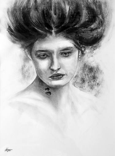
The inspiration pieces below all make good use of space to create a rather realistic more than abstract version of a self portrait. I used the online resource provided to visit a virtual art museum. I was drawn to portraits of women that I felt some similarities and connection with in order to gain inspiration for my own attempt and drawing myself with pencil. I thought that pencil would give me the most control over my drawing and I did use a tracing technique to begin the project. My own lack of confidence in my drawing skills was my biggest obstacle. This piece captures me in a kind of cartoonish form and I actually really like it. I used the principle of light and dark shading in this drawing as well as line and texture for my hair. There is no color in this drawing and I am glad that I left it a black and white piece. I did not think I would enjoy this project as much as I did. I think for a non art major it is pretty good!

My three inspirations
Self Portrait with Necklace by Frida Kahlo
Portrait of Pita Amour by Diego Rivera
Image result for unnamed self portrait
Unnamed by Nuno Pinto

Saturday, April 27, 2019

Module 11 - Art Gallery Visit #2


The title of the exhibit that I visited was, Chemical Light, by Victor Shanchuck. 
This exhibition was made up of a collection of liquid-like observational figure drawings from the 1970s that were made using photographic chemicals instead of classic drawing materials.
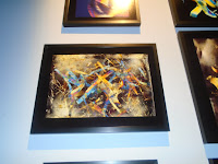
The lighting was dim and was directed only at the drawing themselves. The space was kept rather dark in order to support a slide show that was being projected on two opposite walls. The walls were painted a neutral gray and gave off a sort of mysterious or even "spooky" vibe, in my opinion. There were some leather chairs placed in the center of the room but the seating was very limited. There were two entrances into the exhibit space which was more enclosed than some of the others at Burchfield Penny.The viewer's attention is led from the projections of the art on two of the walls to the  actual pictures on the other two walls. The sound of the projector makes us aware of the projections and gives off a mechanical feel at this exhibit. One wall had several larger pictures lined up in a straight row, while the other had more of of a grid of  several smaller pieces of art. The pieces themselves were all very similar and abstract. The colors and specific shapes of the designs varied and the use of very vivid and varied colors made the art really stand out among the drab background. Each picture was framed very simply in a black square frame which actually barely showed since the background of the pictures are all black. The pictures were not individually titled and labeled. They are all part of one work of art. 


This piece is one of the smaller pieces that was part of a larger display of pieces. It uses complimentary colors of blue and orange which make it very appealing to me. 
I
This next piece uses a variety of color and uses line to create a beautiful effect. In my opinion, this piece looks like a beautiful gift wrapped present. The artist uses the entire space for this piece.

I enjoyed the different use of space in this work. It is not symmetrical yet it still uses the whole space. This piece seems to show the very abstract nature of this type of art. 

It was a very different experience to visit a gallery to specifically study the creation of the different exhibitions. I think it was very interesting to see how the artists use of a specific space can effect the viewers experience and even their enjoyment of the art itself.  I never realized that things such ass wall color and placement of seating etc was so intentional until now. This exhibit that I studied, Chemical Light, would not be my personal preference due to the modern and abstract designs. I can appreciate the overall vibe that the artist was trying to communicate with his exhibit design though and I learned a lot from this gallery visit. 


Sunday, April 14, 2019

Module 10 Mask Creation


    Image result for masks of mexico day of the dead
These 3 masks are all from Mexico. In my search for masks online I found that I most drawn to the masks of this region. All 3 of these are very symmetrical and have  balance and a similar shape. The element of color is best used in 1 and 3 in my opinion. The 2nd mask inspired me with the use of the element of texture with the addition of hair to the mask. I am inspired by these masks to create my own mask that has similar qualities of color, balance, and texture.

My sketches were an attempt to combine the elements in the 3 masks that I was inspired by. I wanted to capture the Mexican ideas from the colorful day of the dead masks and also add the texture of the hair. I did not specify what colors I would use. Reflecting on this, I wish I would have. I planned the balance and symmetry as well as the use of space on the mask that I would use.

My final piece was not exactly what I expected. As I began painting(with the acrylics that I used in the earlier module) I found that I wanted to add certain things to my design. I am not pleased that my mask looks a bit scary. I did truly enjoy creating this mask though, and I think that there are so many ways you can design a mask like this. I can see why so many cultures were able to create such different and creative masks. The possibilities are endless and I did love the creative freedom of this assignment.

Sunday, April 7, 2019

Module 9 Art Project

1.What was it like using your hand as subject matter for a drawing? 
Using my own hand for this drawing was very interesting. It was odd how much I did not actually know the details of my hand until trying to draw it in proportion and with needed details. It did make drawing a bit harder because even with the dominant hand I was only using one hand. 
2. What media did you select - pencil or charcoal? Why?
I selected a pencil because I thought I would have more control and precision than with charcoal . I had a difficult time with the shading activity used for gradient. 
3. How did it feel to create a drawing with your non-dominant hand?
It was very awkward and I had much less control. The non dominant hand allowed me even less artistic ability. 
4. Compare and contrast your final drawings. Do you think they are successful studies? 
I feel like doing the drawings did accomplish a purpose for me. As a non artist, it was a huge challenge and although it may not look it the drawings did take time and concentration. It definitely gave me a greater appreciation for the talent of artists such as Michaelangelo that master the drawing of the human body. 
5. Would you consider using your non-dominant hand to create artwork in the future? No. I felt much less capable of working with this hand and would not prefer to create with this hand. 


Module 9 Videos


 I choose to watch the two videos from the list for different reasons. I watched The Drawings of Michael Angelo because he was a familiar artist to me. His work in the Catholic Church is very well know and his most famous work in the Sistine Chapel has always interested me. I picked the video Valazquez for the opposite reason. I know very little about any of the Spanish artists and I was interested to learn about who he was and what his work looked like. 
I learned a lot about Michael Angelo by watching the film. I did not know that 19 of his works are kept at Princeton for viewing and studying. This man drew all his life and at 12 years old he finally got his hesitant father to accept that he would be an artist as he took an apprenticeship. As an apprentice he used human models to draw detailed sketches of the human body. 30-40 years later, Michael Angelo continued to use the ideas from his mentor although he denied any debt to this man. The drawings that Michael Angelo did of the male human body showed an amazing anatomical understanding of the body. These pictures actually set the ideal standard for body builders as they showed each muscle perfectly sculpted and proportional. He started his sketches at the core of the body and eventually they grew into a moving body. Detail was blended with idealized and some impossible poses. Michael Angelo sought perfections in his 60 years focused on the nude male body. It was not surprising to me then, to learn that he fell deeply in love with a man in Rome. I was surprised however, to learn that he actually wrote a poem complaining about his work on the Sistine Chapel. The pope commissioned him to this famous job and I was surprised that he did not love it. His work as he got older progresses as his own aging body and soul. As he drew the crucifix, this was a far different work from that of the sculpture of Adam. He expressed both hope and dread of death in this painting. 
Valazquez was very different from Michael Angelo. He was a very discrete and educated Spaniard. His art captured the elements of light and his figures were sometimes is shadow. He had one friend, the king, and  one love, his wife. He enjoyed realistic themes and thought that life was all that mattered. To me, his paintings looked like posed photographs against fake backdrops. The detail was in the person he was painting, not the landscape. The pieces were also lacking much color at all. They seemed very gray to me.He was a very slow and deliberate painter. My favorite of his paintings were of the young Prince Baltisar. His paintings of the palace jesters were very interesting as they attempted to express beauty and human quality beneath hideous exteriors. He used the element of soft and strong colors to allow people to look inside these characters.
I thought both of these films were very good at summing up both the life and most famous works by each individual artist. The films add more interest than the textbook as far as allowing us to understand these famous artists, in my opinion. The two sources are paired very well though. There are many more examples of pieces in the text and reading the descriptions allows for a better understanding of the work itself while the videos help us understand the people themselves.